The listbox widget presents a number of options to allow the user to select one or more of the options. In some respects, a listbox is like an encapsulated group of check buttons. Their function is essentially identical, but as we shall see, listboxes are more convenient when many options are involved. In this case, the scrollbar widget and the listbox can work together to allow the user to easily select from many options.
First, lets look at the basic listbox operations. Like buttons, listboxes have a parent, and widget is returned by a constructor function call. Here is an example of how a listbox can be created:
    lbf := frame(f)
    lb := listbox(lbf)
    lb->insert("one two three four five six seven eight nine")
In this case, only the parent was specified to create the listbox.
Table 10.6 lists all of the options for creation of listboxes.
Creating a listbox, however, only generates an empty listbox with
no options for the user to choose. An insert event must be sent to the
listbox to place strings in the listbox. These strings represent
the choices which the listbox presents the user.
Parameter Default Values Description parent widget parent of the listbox width 20 integer listbox width in character units height 6 integer listbox height in lines mode 'browse' 'browse' 'single' 'extended' 'multiple' listbox mode font '' X font text font relief 'sunken' 'flat' 'ridge' 'raised' 'sunken' 'groove' edge relief borderwidth 2 dimension border width foreground 'black' X color text color background 'lightgrey' X color background color exportselection F boolean export selection to X clipboard? fill 'x' 'x' 'y' 'both' 'none' how to expand when resized
A listbox has a mode which specifies how the user can select items. By default, the listbox is in 'browse' mode. In this mode, the user can only select one item from the listbox, but the selection can be dragged. The user can select the item, drag the mouse, and the selection will follow the mouse. If there are more items in the listbox then are displayed, the listbox will scroll to display the selected items as the user drags the mouse. In the example above, nine items were put into the listbox, but by default, only six are displayed. By dragging the selection, the user can access the items that are outside of the displayed range. A listbox in 'single' mode is like the 'browse' mode list box except that the user can no longer drag the selection.
A listbox in 'extended' mode allows the user to select multiple items from the listbox. Selections can be made by selecting individual items or by selecting and dragging over several items. The control key can be used to augment the selected items, and the shift key can be used to specify the beginning and end of a range of items to select. This mode is analogous to the 'browse' single selection mode, and 'multiple' mode is analogous to 'single'. In 'multiple' mode, the user can only add and remove items from the group of selected items by single selections of individual items.
It is important to be able to retrieve the selection the user has indicated. There are two ways of doing this. Each time a selection is made, a select event is generated. So continuing the example above:
    whenever lb->select do
        print "Items selected:",lb->get($value)
this whenever will cause the interpreter to print a message each time
the selection in the listbox changes. The entire selection is returned
as indexes in $value. The get request can be used to map the
selection offsets to the strings they represent. The selection request can
also be used to retrieve the current selection indexes:
print lb->selection()i.e. the
$value in the above example. Table 10.7
lists all of the listbox events.
A final common listbox operation is deleting all of the elements in the listbox. This is easy to accomplish:
lb->delete('start','end')
Event I/O Values Description background 
X color change background color bind <X> <G> associate Xevent <X> with Glish event <G> borderwidth dimension change border width clear string clear indicated items, use 2 strings to clear range delete string delete indicated items, use 2 strings to delete range exportselection boolean export selection to X clipboard? font X font change text font foreground X color change foreground color get 
integer request items, i.e. map indexes to items height integer listbox height in lines insert string insert items, optional 2nd param insert index mode 'browse' 'single' 'multiple' 'extended' change listbox mode relief 'flat' 'ridge' 'raised' 'sunken' 'groove' change border relief see string scroll listbox so specified index is visible select 
string generated when user makes selection, can also be used to select items selection integer get indexes of the current selection view record scrollbar update event width integer listbox width in character units xscroll 
double information for horizontal scrollbar update yscroll double information for vertical scrollbar update
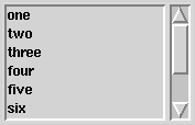
With a plain listbox, some items may be out of view as we saw above. By connecting scrollbars to the listbox, however, the user can scroll the box to look at the items, and the user gets feedback about how many items are in the box and which portion of the items are currently being displayed. Indeed, this is the type of feedback users expect. A scrollbar can be added to the example above as follows:
    lbf := frame(f,side='left')
    lb := listbox(lbf)
    sb := scrollbar(lbf)
    whenever sb->scroll do
        lb->view($value)
    whenever lb->yscroll do
        sb->view($value)
    lb->insert("one two three four five six seven eight nine")
In this case, we had to create a new frame widget, lbf, because we want the
listbox and the scrollbar to be side by side. Figure 10.6 shows
what this would look like.
Two whenever statements are required so that the listbox and the scrollbar update each other. The scrollbar only generates one event, scroll. The value of this event must be relayed to the widget that the scrollbar is controlling, here a listbox. These scroll events are generated by the user moving the scrollbar thumb, i.e. the raised part in the middle of the scrollbar.
The listbox generates two scroll related events, xscroll and yscroll. These allow for both vertical and horizontal scrollbars to be attached to the listbox. The yscroll events are generated either by the user dragging the selection or in response to view events. The xscroll events are generated in response to view events.
This interaction is pretty interesting. The scrollbar generates the scroll event but does not update its appearance. Its apperance is updated by the resulting view event generated by the widget the scrollbar is controlling. Without these whenevers, no scrolling.