Buttons are the simplest widgets which actually do something, i.e. generate events. Buttons are used to create an area of the screen which allows the user to click on the area and cause some action. In Glish/Tk, the action which the button itself causes is the generation of a press event. The Glish script can then handle this event like it would any other event.
Plain buttons are the simplest kind of buttons. They have no state, and the only thing that happens when the user presses them is that a press event is generated. Here is an example of how plain buttons are created:
    fme := frame( )
    b1 := button(fme,'Button One')
    b2 := button(fme,'Button Two')
    whenever b1->press do
        print 'Button One Pressed'
    whenever b2->press do
        print 'Button Two Pressed'
This example generates a simple dialog containing two buttons, and when the user
presses either of the buttons, a message is printed by the whenever
statements. The dialog box which this creates would look like the one in
Figure 10.2.
It is simply a frame with two buttons. In addition to the parameters shown in this example, buttons accept many other construction parameters. These are summarized in Table 10.4.
Parameter Default Values Description parent widget parent of the button text 'button' string text label for button type 'plain' 'plain' 'radio' 'check' 'menu' button type padx 7 dimension horizontal padding around text pady 3 dimension vertical padding around text width 0 integer width in character units height 1 integer height in character units justify 'center' 'center' 'left' 'right' justification of text font '' X font font of text relief 'raised' 'flat' 'ridge' 'raised' 'sunken' 'groove' edge relief borderwidth 2 dimension border width foreground 'black' X color color of text background 'lightgrey' X color background color disabled F boolean is inactivated? value T Glish value value returned with press event fill 'none' 'x' 'y' 'both' 'none' how to expand when resized group parent widget only for radio; indicates how radio functionality is grouped
In this example, if fme had been constructed with side set to left, then the buttons would have been arranged horizontally instead of vertically. In fact, if the frame is sent side events:
    fme->side('left')         # arrange left to right
    fme->side('right')        # arrange right to left
    fme->side('bottom')       # arrange bottom to top
the buttons can be dynamically rearranged. In an analogous way, the text of
the buttons can also be changed:
    b1->text('First Button')
    b2->text('Second Button')
The other events which buttons accept are similar to the construction parameters;
they are outlined in Table 10.5. The only event which buttons
generate is the press event, and this is the hook through which buttons
cause actions in a script.
Event I/O Values Description background 
X color change background color bind <X> <G> associate Xevent <X> with Glish event <G> borderwidth dimension change border width disable disable widget, must be balanced by enable disabled boolean set state, disable (T) or enable (F) enable enable widget, must be balanced by disable font X font set font for text foreground X color change foreground color height integer set height (in character units) justify 'center' 'left' 'right' set justification for text padx dimension set horizontal padding around text pady dimension set vertical padding around text press 
Glish value indicates that button was pressed relief 'flat' 'ridge' 'raised' 'sunken' 'groove' change border relief state 
boolean set state for button (check and radio only) text string set text width integer set width (in character units)
As shown in Table 10.4, there are several different types of buttons - plain, radio, check, and menu. These are set with the type parameter. The example above showed how plain buttons work.
Check buttons are identical to plain buttons, but check buttons have state. Their state is indicated by their appearance. Check buttons allow the user to select multiple items from a list. Here is an example of a check box:
    root := frame( side='left' )
    fbox := frame( root, borderwidth=0 )
    box := [=]
    for (i in "one two three")
        {
        box[i] := button(fbox,paste('button',i),type='check',value=i)
        whenever box[i]->press do
            print "check button", $value, "pressed"
        }
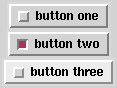
When the user clicks on check buttons, the appearance of the button
changes to indicate the state of the button. Note that the the value
parameter to button has been used to permit later differientation of
the buttons. The graphic that this script creates is shown in
Figure 10.3. Note, however, that the second button has been
pressed by the user.
The script prints ``check button two pressed'' in response to the selection of the second check button. This action is again accomplished with a whenever statement. Each time one of the check buttons is pressed a press event is generated.
The state of a check button can be querried with the state event:
print box[2]->state()Glish's request/reply mechanism is used to get results back from the user. Since the second button was selected once, the output of this statement will be T. The state event can also be used to set the state. So if we wanted to unselect the second check button, we would do something like:
box[2]->state(F)and the the appearance of the second button's check box will change to look like the checkboxes of the other two check buttons.
Radio buttons are very similar to check buttons with the exception that radio buttons are mutually exclusive. This means that the state of only one radio button in a group can have its state set to T. By default, a group is defined to be all radio buttons within a given frame, but the group parameter can be used to change this grouping.
To change the dialog in Figure 10.3 to use radio buttons instead of check buttons, something like the following would be done:
    for (i in "one two three")
        {
        box[i] := button(fbox,paste('button',i),type='radio',value=i)
        whenever box[i]->press do
            print "check button", $value, "pressed"
        }
    box[i]->state(T)
Notice that we are using the same toplevel frame from the example above, but
when each box[i] is reassigned, the previous widget is deleted. Lets
assume what we wanted to have an extra column of radio buttons, we could do
it as follows:
    nf := frame(root, borderwidth=0)
    for (i in "four five six")
        {
        box[i] := button(nf,paste('button',i),type='radio',
                         value=i,group=fbox)
        whenever box[i]->press do
            print "check button", $value, "pressed"
        }
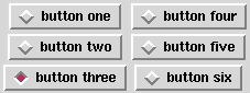
After running these two small scripts, the dialog Figure 10.3 would
change dynamically to look like Figure 10.4.
Here again, a press event is generated each time a user selects one of the buttons, and the state of the buttons can be set and queried with the state event. Now, however, selecting button five, for example, will cause the previously selected button, here button three, to be unselected. This is the behavior of radio buttons. Specifying the group for the second column of radio buttons made the two columns act as one group.
Like radio and check buttons, menu buttons are more complicated than plain buttons. Menu buttons do not have state, but rather their action when pressed is to display more buttons. This allows the user to build menus containing all of the buttons discussed above.
As before, a button is indicated to be a menu by setting the type parameter. Here is a simple example:
    top := frame()
    bar := frame(top,side='left',expand='x')
    file := button(bar,'File',type='menu')
    opt := button(bar,'Options',type='menu')
    rec := [=]
    rec['space'] := frame(bar,width=150,height=1)
    help := button(bar,'Help',type='menu')
    for (i in "A B C")
        {
        rec[i] := button(file,paste('File',i))
        rec[len(rec)+1] := button(opt,paste('Opt',i))
        rec[len(rec)+1] := button(help,paste('Help',i))
        }
In this example, there are a couple of things to note. First a frame, bar is
created to contain all of the menus. This is how a menubar is created in Tk. Note
that the expand parameter is set to 'x' this indicates that bar
should only expand horizontally. This is to prevent the frame containing the
menu buttons from expanding vertically if the user resizes the window. Next,
two menu buttons, file and opt, are placed in bar, and because
of the way bar was constructed, these menu buttons are organized left to
right. Next a frame is used to space the next menu button out to the end of the
dialog, and then another menu, help, is added to the menubar. The
loop simply fills each of the menu buttons with entries which are simply more
buttons. The key thing to notice is that the parent of these buttons is a
menu button.
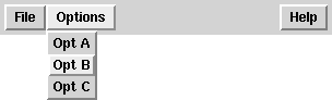
Entries in a menu button are the only case in Glish/Tk where a widget can have a parent which is not a frame. Figure 10.5 show what the menubar created above will look like when the user selects, i.e. presses, the ``Options'' menu button and selects the second menu element. The selection by the user of entries in a menu button can be caught using whenever statements in the same way as regular buttons. For example:
    whenever rec['A']->press do
        print "Got It!"
will cause ``Got It!'' to be printed by the interpreter whenever the first
entry in the file menu button is selected.